

Case Study
Minneapolis Bike Shop
In 2024, as part of my work on the Google UX Design Professional Certificate, I designed a mobile bike shop app from the ground up to meet the needs of customers looking to buy bikes and schedule services with a local community-oriented bike shop.
Client
Local Bike Shop
Project Type
UI/UX Design, Product Design, UI/UX Research
Role
Product Designer
Year
2024
Background
For this project, I decided to donate my time and expertise to a local community-oriented bike shop. I sat down with employees from the shop to talk through the business’ needs and learned that businesses like theirs rely on new bike sales, and ongoing maintenance for the bulk of their business. I also learned that they were struggling to compete with large brands going direct-to-consumer, and large retailers that have a strong online presence. For this to change, they needed to improve their online customer experience significantly, but they didn’t know where to start.
The Problem
Knowing that improving the online experience was necessary for the shop to compete, I conducted some initial user research regarding how customers choose where to buy a bike and schedule services, and what they look for in a bike shop website or app. This research indicated that customers run into three primary shortcomings when using existing local bike shop apps and websites:
- Picking the right bike is difficult. The majority of customers are not experts, do not think in terms of brands/specifications, and rely on the knowledge/opinions of others to figure out the best bike for them. This is difficult to achieve online without significant prior knowledge or research.
- Scheduling maintenance on existing bikes is cumbersome. Scheduling services often involves calling a bike shop to speak to someone in-store, or actually visiting the bike shop itself. This makes it a significantly heavier lift, and discourages some customers from getting routine maintenance—preferring only to schedule maintenance when there’s an existing problem.
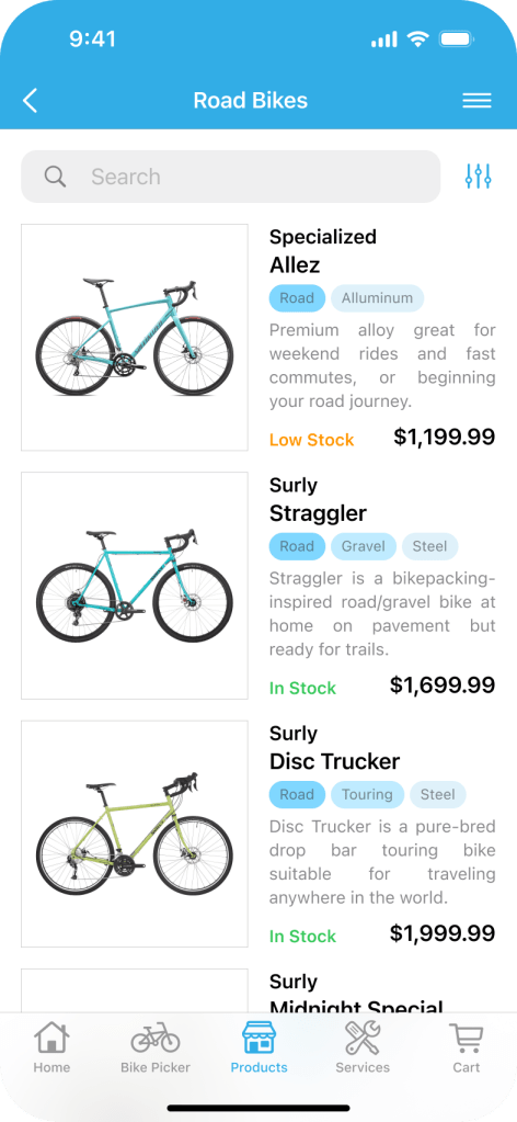
- Stock status is often missing, and frequently inaccurate. Many bike shop websites don’t include stock information about their products at all, and the ones that do often don’t have the product in stock when you show up at the store. This makes trusting a website/app difficult, and pushes customers to larger retailers that don’t have this issue.
These points were confirmed by a competitive audit, which further fleshed out the broader landscape of bike shop apps and websites.
Personas
To facilitate designing for these problems, I distilled my user research and problem statements into two personas:

Carl
“I want to trust the people I give my business”
Age: 45
Education: MA, Psychology
Hometown: Minneapolis, MN
Family: Wife, Two Kids
Occupation: Teacher

Gia
“I know what I want, I just want you to give it to me.”
Age: 32
Education: BA, Studio Art
Hometown: Minneapolis, MN
Family: Partner, Cat
Occupation: Librarian
In addition to writing out these personas’ goals, frustrations, and backgrounds to get to know potential users, I mapped out their user journeys to better understand how they would interact with the app, and what their goals would be at each stage. With this information in-hand, I moved on to finding solutions.
Hypothesis
I hypothesized that a bike shop app that met users needs and that could compete against direct-to-consumer brands and large retailers would feature:

A Bike Picker/Wizard

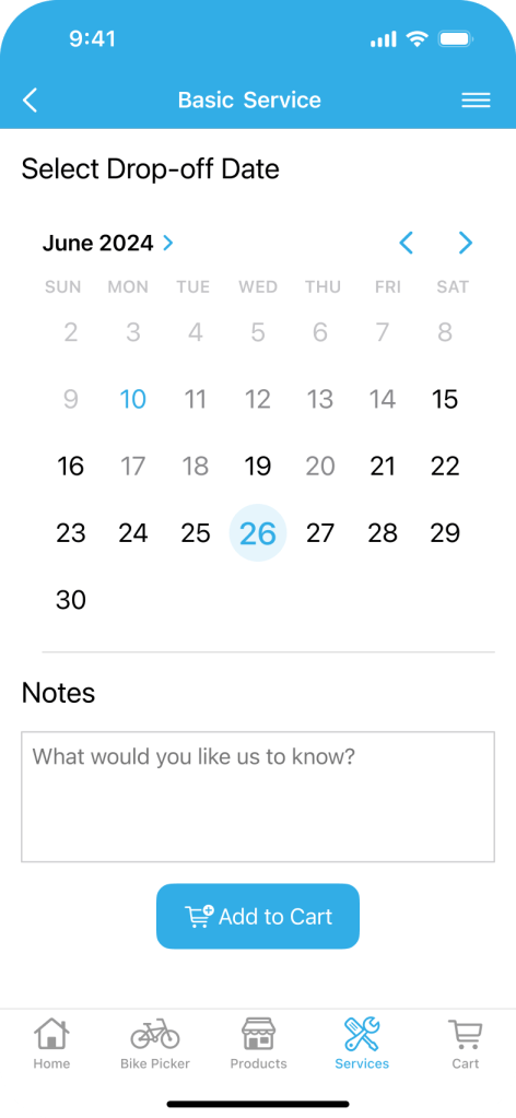
An Online Service Scheduler

Clear Stock Information
With these goals in-mind, I got to work on paper wireframes for the primary screens in the user flow for these features.
Paper Exploration
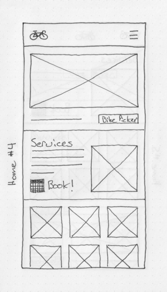
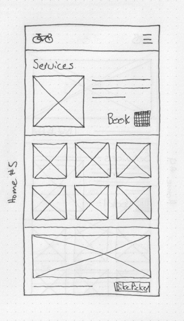
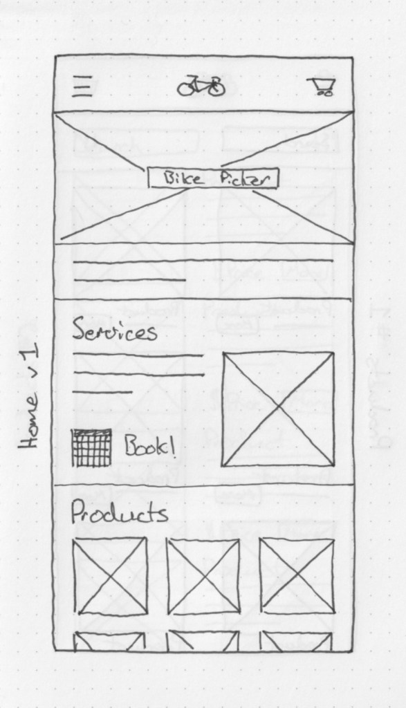
Knowing I was designing an app from the ground-up, and I needed to make a variety of decisions with regard to style, layout, and approach, I drew up quick sketches of the nine screens most important to my user flows.
I drew up five different iterations of each so I could get a variety of ideas out and try things quickly before settling on a rough v1 to refine further. For example, on the home screen, I explored the navigation layout, whether to place the bike picker and scheduling options on the screen, and what order things should be in.
I continued this process through all the screens—exploring different information architectures, containment themes, etc. until I settled on a basic style for the app that I could iterate on later.
I collected all of these paper wireframes in a Figma file for further iteration.


Low-Fidelity i1
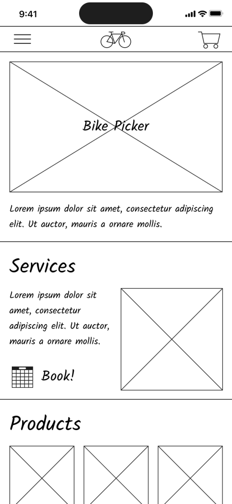
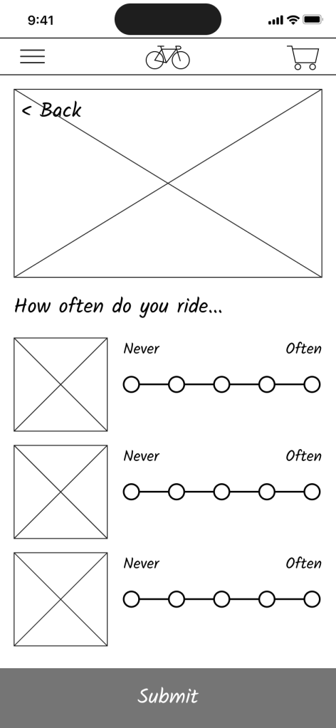
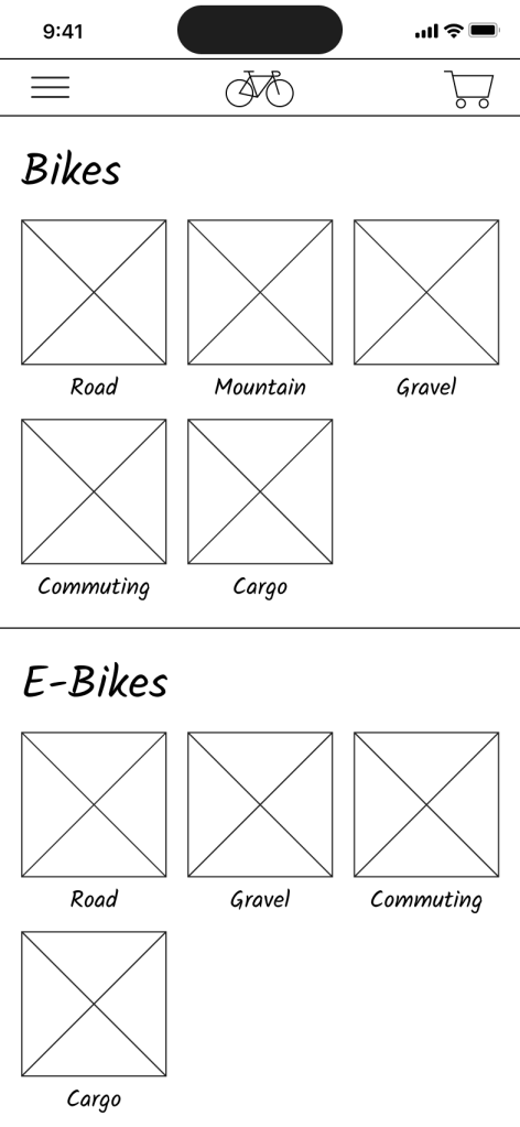
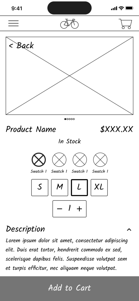
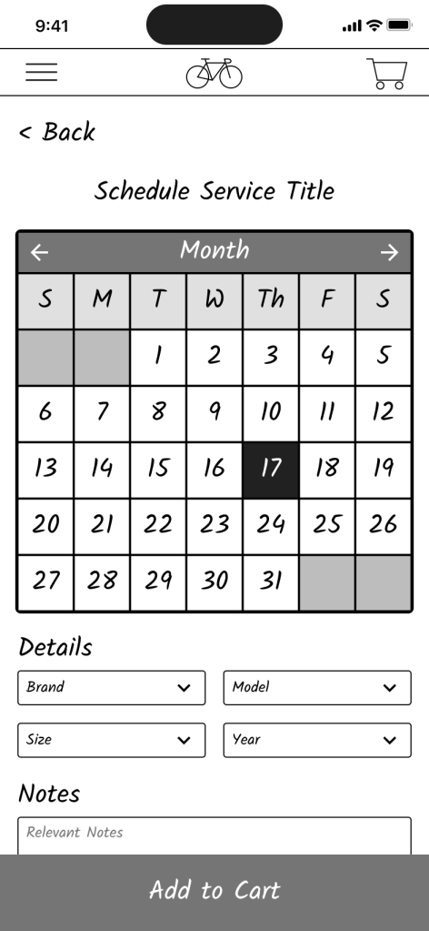
With the general flow sketched out, I worked on creating low-fidelity digital wireframes. I chose to use a simple “handwritten” typeface, and a black and white color palette in order to focus my attention on the basic functionality and layout of the app.
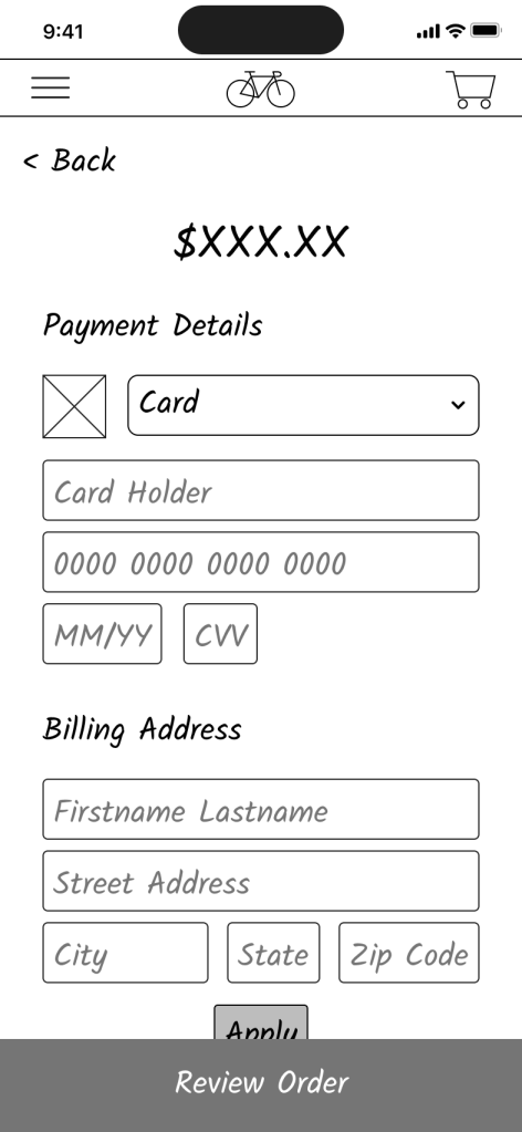
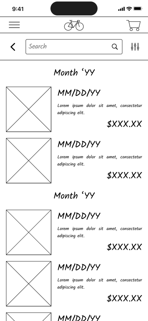
Once I had a prototype created, I drew up a research plan for a usability study, and ran an in-person moderated usability study. I focused the study on the bike picker functionality and how it compared to in-person help, the service scheduling flow, and the ease with which people found stock information.
I collected notes during the usability study in a spreadsheet, rating the ease of completing different tasks, and documenting the click path followed as well as relevant quotes from participants. I then took this information, sorted it into categories, and generated insights from the study in a FigJam Board.
Insights from the usability study indicated that:
- the bike picker questions were lacking contextual clues;
- it was unclear to some users what different screens were—for example, the cart; and
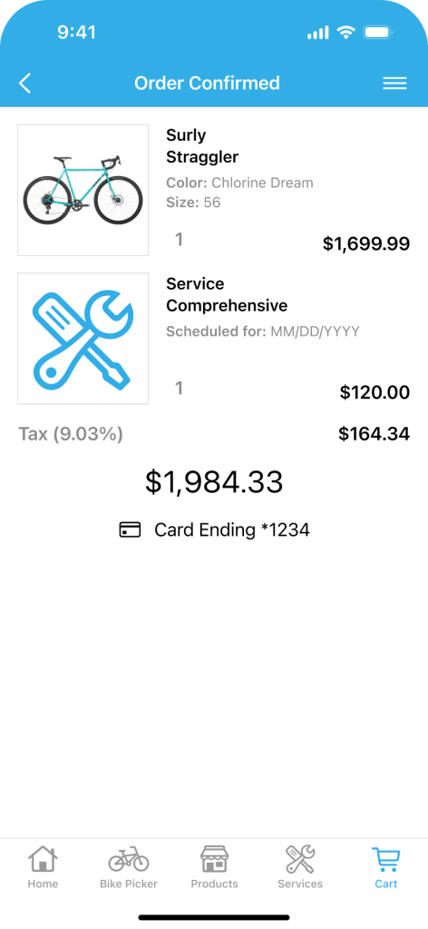
- the checkout flow needed more context on taxes/shipping.





Low-Fidelity i2
The insights from the study led me to question a few assumptions and patterns I had set up early in my design process.
I ended up making a few changes to solve for these issues:
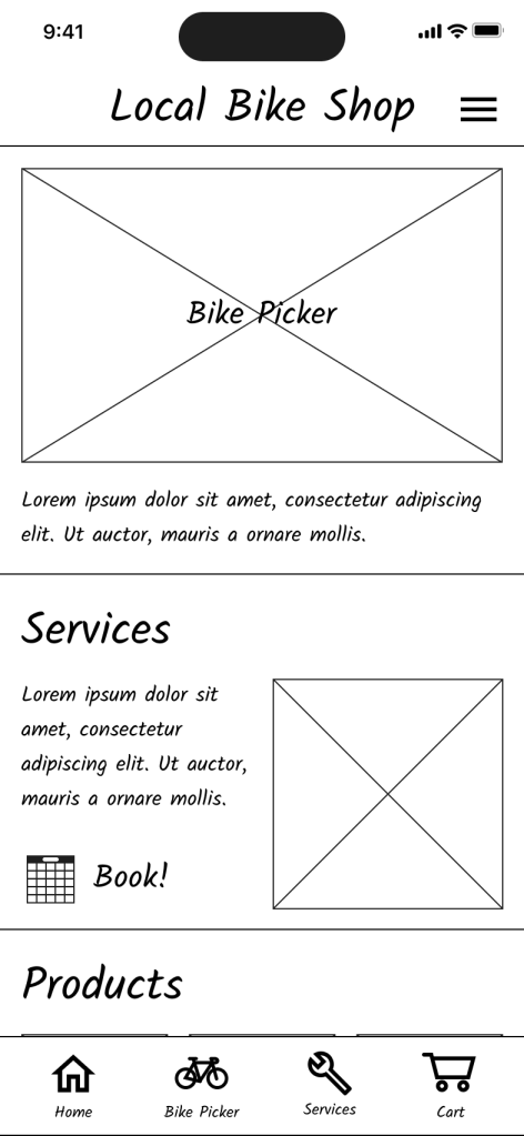
- replaced the logo in the top nav with the current screen name to provide more navigation context;
- added a bottom tabbed navigation bar to easily access the most-used pages; and
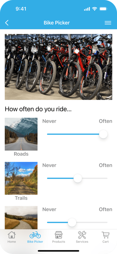
- added additional context to the bike picker (descriptive text) and checkout flows (taxes and fees).
After making these changes, I created another low-fidelity interactive prototype to confirm the flows worked, and nothing was negatively impacted by the changes.
High-Fidelity
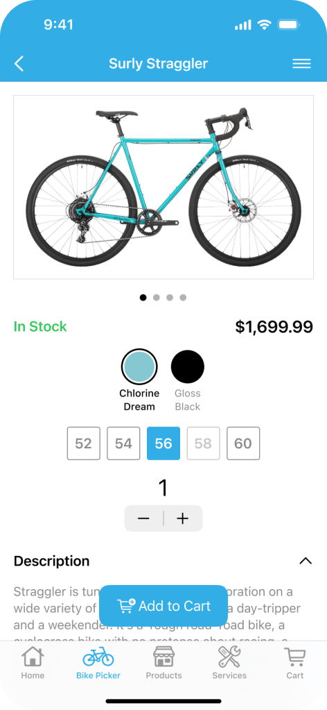
I built the color palette of the app off of the shop’s primary brand color (a bright blue), and took this project as an opportunity to explore the iOS 18 design resources. This simplified the process of moving to high-fidelity through the use of many pre-existing components, and the use of many others with minor modifications.
However, certain elements—like the product color and size swatches, expanding product information sections, and the scheduling page cards—had to be created from scratch.





Final Iterations
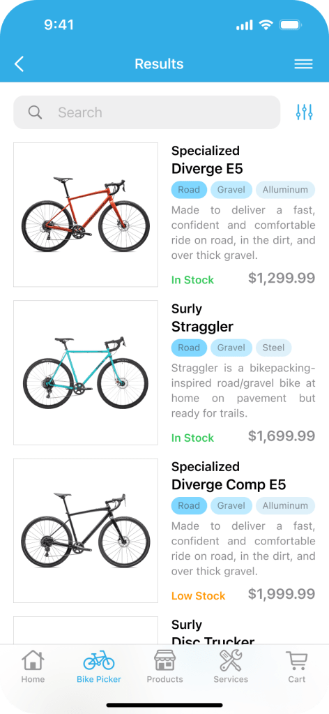
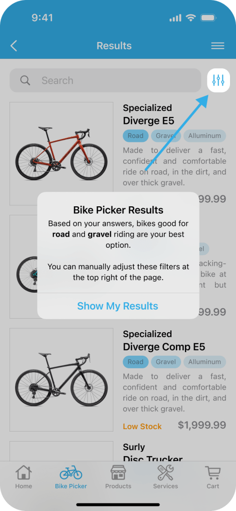
With designs in hand, I ran another moderated usability study. This time, I focused on the bike picker experience—whether the results page’s function was clear (showing a filtered product page that could be filtered further)—as well as whether the scheduling and check out flows functioned as users expected.
Participants indicated that the scheduling and checkout flows were clear and intuitive, but some felt the bike picker could more explicitly call out the fact that it filters products to display its results, and that these results could be filtered further. As a result, I added an overlay modal to the bike picker results page explaining the feature, and pointing users to the filter options. I also made a handful of additional tweaks (like adding a bike-sizing guide to the product page), and arrived at a fifth and final iteration of the primary user flows.
Takeaways
The project wrapped with the completion and hand-off of the final prototype to employees at the bike shop.
While much of the app followed patterns typical of ecommerce/online shopping apps, I was particularly proud of my work on the bike picker. In researching the design and functionality there, I came across a couple instances where companies had tried to include a similar feature, but ran into issues that undermined trust in the results—poor question framing, issues with filter appropriateness, incongruent visual design, etc.
As I built my version out, I began to understand why so many companies struggle to implement a feature like this—many of the features I wanted to add were outside the bounds of what the shop was able to support for one reason or another. For example:
- I wanted to add additional filtering options. However, the shop’s inventory system didn’t support many of the traits people would want to filter for.
- I wanted to add an option to chat with an employee—but shop staffing was low and there was concern about staff being tied up on the phone/computer instead of helping customers in-store, and they lacked the infrastructure to train and implement AI.
- I wanted to add an option for customers to schedule test-rides. Unfortunately, similar to #2, shop employees indicated that their current staffing level couldn’t support scheduled test-rides (as opposed to first-come, first-serve availability).
Because of these constraints, the bike picker here is more limited and high-level. While feedback on my bike picker design was very positive, with 3/5 study participants saying it was as-good or better than working with someone in the store based on their needs, I believe it remains a significant area of opportunity.